Even though I've been a quilter for nearly 20 years, we usually have a comforter on our bed. Without air conditioning (even though it has been a cool summer), I took that off and put on this quilt. As I looked at the label, (yes, this one actually got one) I noticed that the date was 9/1/96. So, this one is approaching it's birthday. Wow, I just can't believe that I made this so long ago. At that time, we lived in the All-American two story with a front porch. I wanted something summery looking, and since the rail fence was a favorite, I made this. While I probably wouldn't sew this quilt today, I still have a soft spot for the little florals in it.
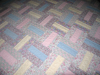
The colors in the detail shot are most accurate, but I wanted to include a nearly full view. The green triangles and border are made of an early Judie Rothermel thirties print. It has faded quite a bit, especially on the two opposite sides. This quilt didn't have much direct sun, but you wouldn't know it. Doesn't it seem as if the old quilts hold their color better? I look at the vintage quilts every chance that I get, and very few have faded. Still, this one is soft and snuggly, and just the right weight for summer sleeping.


2 comments:
Lovely quilt! Those fabrics and colors reflect that era where everything was pink and blue, or peach and green. Trends have changed, but that quilt is still very pretty and soothing I think.
You are so right about the color palette! Thanks for the kind words.
Post a Comment